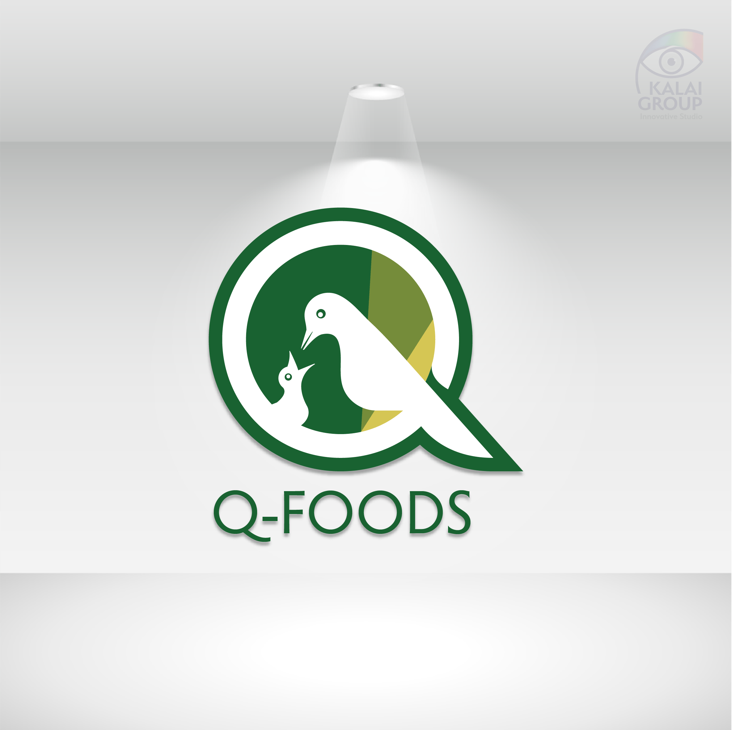
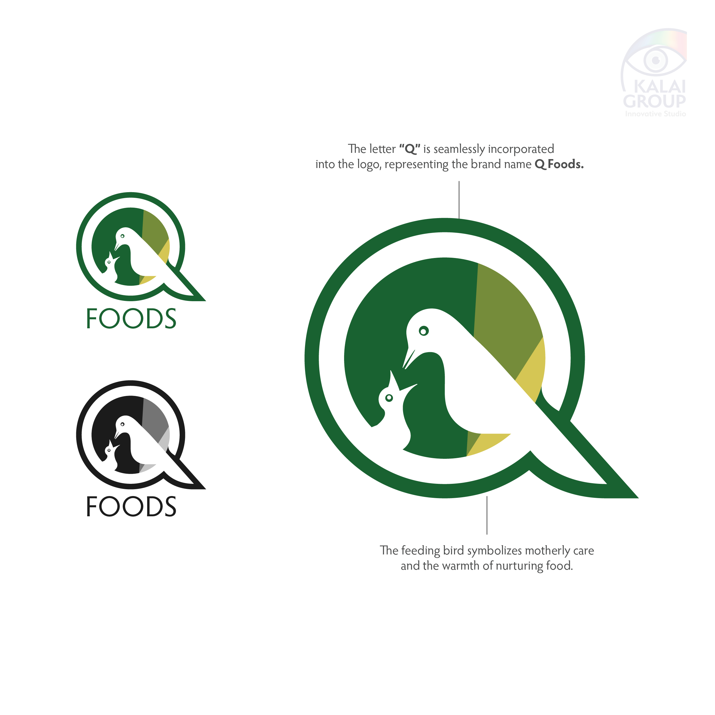
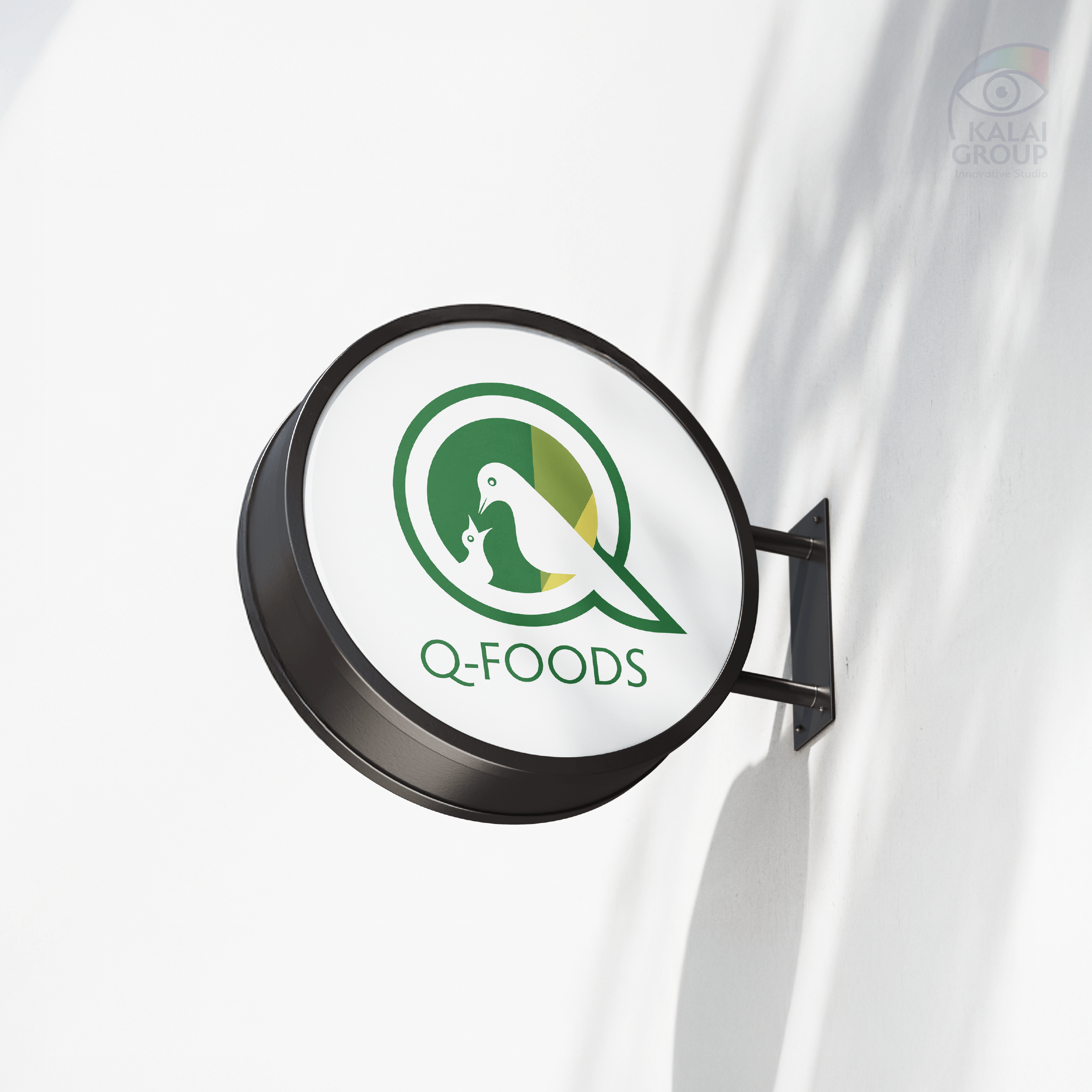
Q – FOODS is a brand that connects food, care and warmth through visual storytelling. It delivers more than just products, it ensures a motherly feeling in every serving.
It reflects the vision of nutritious and delicious food made with love, while retaining the brand’s organic essence.
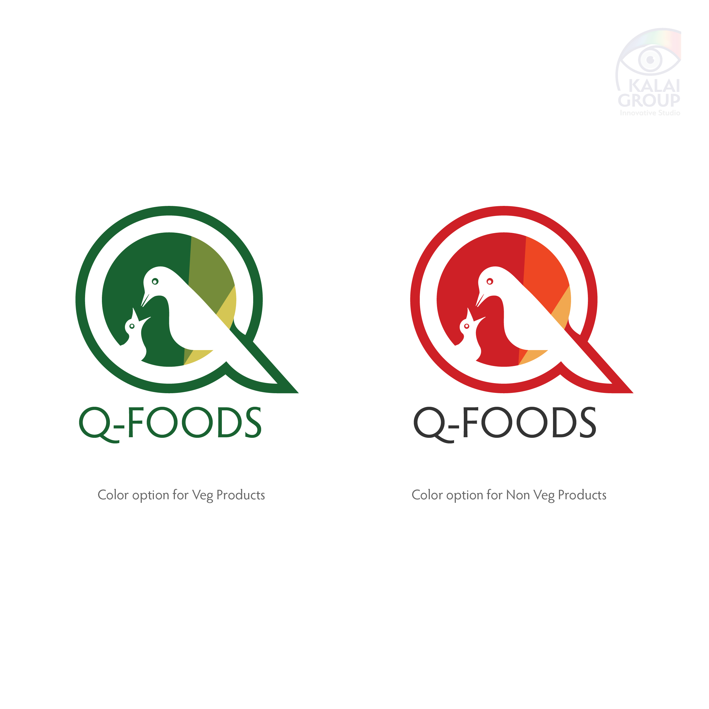
The idea was to craft a logo that feels familiar and comforting, creating an instant emotional connection. By integrating the brand’s initial “Q” and the colour palette was chosen thoughtfully, reflects organic flavours, natural freshness, and an eco-conscious identity.